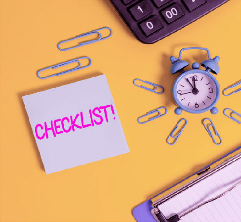
Graphic Design Language
Terms & definitions of common words

www.firewhitewebanddesign.com.au
GRAPHIC DESIGN WORDS
Terms & definitions of common words
As a graphic designer we know the terms and definitions with common words used in the industry as it’s something we do regularly.
It did occur to me though recently that my clients did not. So, I thought it maybe easier if I broke it all down in alphabetical order the terms and definitions of the design words/language we use regularly.
If you’re not up to scratch with the design lingo don’t fret. The list I have provided below, will help you have more of understanding when you and your designer start working together.

ANALOGOUS
Is a colour scheme used colours that are next to each other on the colour wheel.

CMYK
Is a colour model that is used for print purposes. CMYK colours begin as white and then get darker as more colours are combined.

COMPLEMENTARY
Are colours opposite to each other on the colour wheel.

EPS
‘Encapsulated Post Script’. A standard graphic file format intended for placing images on drawings within a postscript document.

FAVICON
The tiny icon on your browser tab when you view your website. Very simplified mark that is legible at small sizes.

GIF
‘Graphic Interchange Format’. Has the option to save several images in the same file making it appear as a video.

GRADIENT
A gradient is a gradual change of colours (such as green turning gradually into blue) or a colour fading into transparency. There two common types of gradients: radial & linear.

HEX
Is a 6-digit combination of numbers & letters defined by its mix of red, green & blue.

HUE
A hue is a way to describe a colour. And a hue can be any colour on the wheel. For example, red, blue and yellow are all hues.

ICON
Are something we all see practically every day- they’re images used to represent objects or actions.

JPEG
‘Joint Photographic Expert Group’. Mostly used for digital purposes, supports transparency.

MOCK-UP
A mock-up is a realistic, normally 3D representation of design, used to demonstrate how a design will look in the real world.

OPACITY
Opacity enables us to make an element of a design transparent. The lower the opacity, the more transparent an element is. For example, 100% opacity means an object is solid.

MOODBOARD
The starting point for a lot of designers, a mood board is a way for designers to collect together lots of visual references for a new design project- combination of photos, images or typography.

PALETTE
A palette is the colour scheme that is chosen for a specific design or brand-making up part of a brand style guide.

PANTONE
The Pantone Matching System is a standardised colour scheme used for printing. Each colour has its own number and name and this makes it easy to reproduce and reference the colours super easy.

'Portable Document Format’. Also, an abbreviation for the Netware printer definition file. Captured all elements of a printed document as an electronic image.

PNG
‘Portable Network Graphics’. Raster graphics file-format that supports lossless data compression.

PRIMARY COLOURS
Red, yellow & blue. They are the three basic colours that are used to mix all hues.

PRIMARY LOGO
The logo you use most of the time.

RGB
Colour is a modela in which red, green and blue are combined in various ways to create other colours. RGB is used for on-screen purposes.

SECONDARY LOGO
May be called an ‘alternate’ logo. Simplified version of the primary logo. Alternative design layout and legible in small sizes.

SECONDARY COLOURS
Orange, green & purple. They are achieved by mixing two primary colours together.

SPLIT COMPLEMENTARY
A variation of complementary colour scheme. In addition to the base colour, it uses the two-colour adjacent to its complement.

SQUARE
A combination of four colours equally spaced around the colour wheel.

SUBMARK
Good for digital spaces & social media. Does not include full business name. Normally includes letters, numbers or symbols.

STYLE GUIDE
A style guide is an important part of branding. They determine the correct set of standards for branding of a business or publication. It’s to ensure that all brands have complete uniformity and are kept looking spic & span.

SVG
‘Scalable Vector Graphic’. A vector image format for two-dimensional graphics with support for interactivity & animation.

TINT
A tint is a variety of a colour. Tints are created when you add white to any hue on the colour wheel. This lightens and desaturats the hue, making it less intense.

TYPOGRAPHY
The term typography refers to tow things. The style and appearance of printed words and to the art and procedure of arranging type to make it readable, legible, attractive & engaging in print and digital designs.

Sign up to today to get lots of free useful tools & tips
right into your inbox. Let us help spark your business!
Let’s Create
Interested in working together? Got an amazing idea, but need help to spark your inspiration? Great!
Send me a message and let’s talk design & we can create something amazing that will turn heads.