Magazine Layout

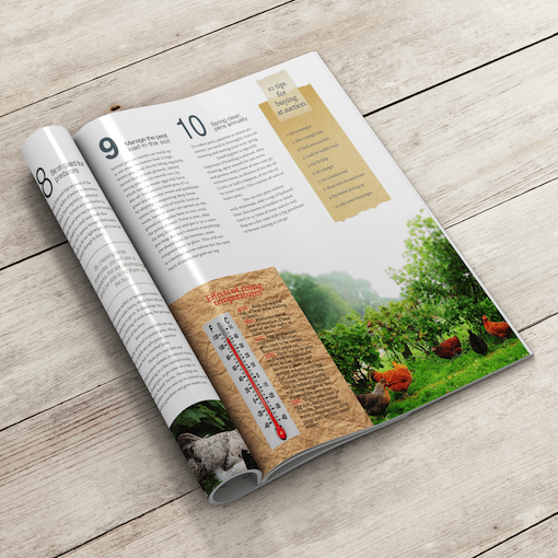


This magazine article was created with simplicity, sophistication, and emphasis on caring for chickens.
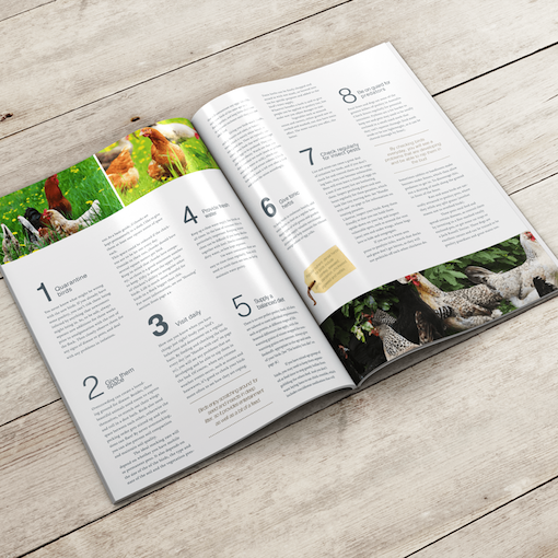
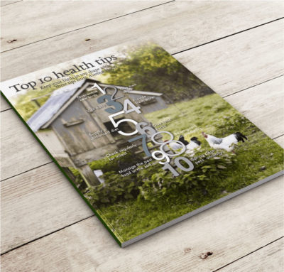
I sourced images that communicate a fresh feeling for the free-range chickens all set in a lush landscape paddock/meadow. The layout I wanted was a simple design that was calm and refreshing and by doing this I used different tones of greens and greys that gives a combination of harmony and balance. These colors are throughout the article both in the fonts and in the images.
I wanted the orientation of the paper to be set portrait, which I believe works better for the body text and easy for the audience to read. I then created 3 columns of the text so that when reading it, it flowed easily from one point to the next on all pages. I made sure there was plenty of white space around all images and body text. Creating this negative space helped portray the key characteristics and communication objective of this design, being a simplistic & tasteful magazine.
Related Designs