South Coast Lock & Key
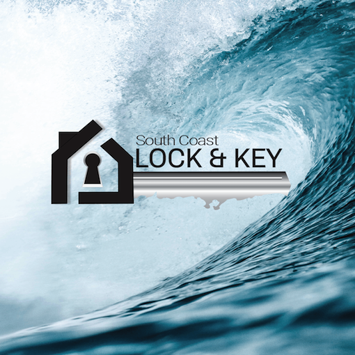
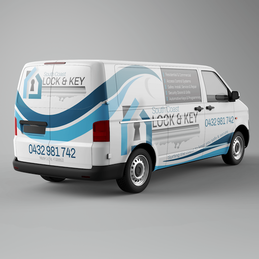


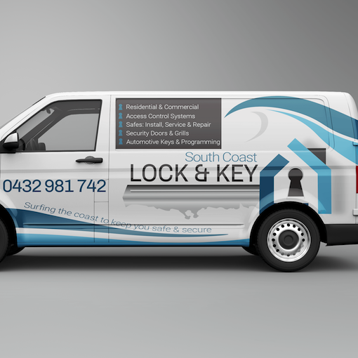
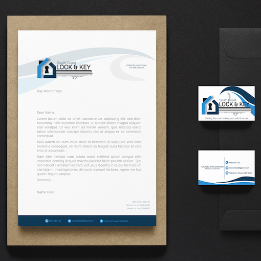


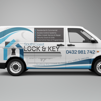
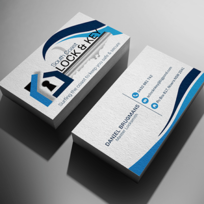


South Coast Lock & Key were after a full re-branding of their existing business that’s been established for 8 years in the Shoalhaven. They wanted something that was unique, modern, clean & crisp design to stand out from their local competitors.
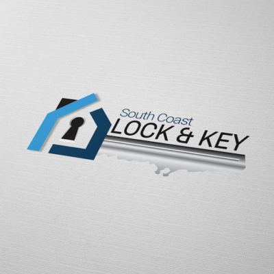
They didn’t want the usual padlock and key symbol everyone else used. So, I came up with a design that fitted the design brief perfectly.
The key cut is the coastline of our South Coast. The business carries out work right up and down that coastline. Their catchphrase is “Surfing the coast to keep you safe and secure”. So, I implemented a wave that completed the same colours in the logo for their design on the van and stationery. It’s been a successful outcome and have some very happy clients.


